library(dplyr)
#>
#> Attaching package: 'dplyr'
#> The following objects are masked from 'package:stats':
#>
#>     filter, lag
#> The following objects are masked from 'package:base':
#>
#>     intersect, setdiff, setequal, union
library(tidyr)
library(ggplot2)
library(canpumf)
#> canpumf.cache_path is not set.
#> Downloaded data is stored in tempdir() and discarded when this R session ends, so it will be re-downloaded next time.
#> To persist data across sessions, set a cache directory:
#>   options(canpumf.cache_path = "~/canpumf_cache")
#> Add that line to your .Rprofile to make it permanent.
options(canpumf.cache_path = Sys.getenv("COMPILE_VIG_CANPUMF"))
The Canadian Housing Survey PUMF data is a rich dataset on Canadian housing preferences and needs. This vignette is adapted from work done by Nathan Lauster and Jens von Bergmann. We start by establishing a connection to the 2018 CHS, downloading the data, parsing the metadata and creating the local database if needed.
chs_pumf <- get_pumf("CHS","2018")

chs_pumf |>
  select(1:5) |>
  head(10)
#> # A query:  ?? x 5
#> # Database: DuckDB 1.5.4 [root@Darwin 25.5.0:R 4.6.0//Users/jens/data/pumf.data/CHS/2018/CHS_2018.duckdb]
#>    PUMFID PHHSIZE PAGEGR1 PAGEGR2 PAGEGR3
#>    <chr>  <fct>   <fct>   <fct>   <fct>
#>  1 00001  1       No      No      No
#>  2 00002  1       No      No      Yes
#>  3 00003  1       No      No      No
#>  4 00004  1       No      No      No
#>  5 00005  1       No      No      No
#>  6 00006  1       No      No      No
#>  7 00007  4       Yes     Yes     Yes
#>  8 00008  2       No      No      Yes
#>  9 00009  1       No      No      Yes
#> 10 00010  4       No      Yes     Yes
The data comes automatically labelled, but column names are left as coded in the data. That makes it easier to work with the data if one is very familiar with the particular survey, but can also be a barrier. In that case one can apply column labels on the fly.
chs_pumf <- chs_pumf |>
label_pumf_columns()
chs_pumf |>
select(1:5) |>
head(10)
#> # A query: ?? x 5
#> # Database: DuckDB 1.5.4 [root@Darwin 25.5.0:R 4.6.0//Users/jens/data/pumf.data/CHS/2018/CHS_2018.duckdb]
#> `Unique household identifier` `Household size` Demographic information - ag…¹
#> <chr> <fct> <fct>
#> 1 00001 1 No
#> 2 00002 1 No
#> 3 00003 1 No
#> 4 00004 1 No
#> 5 00005 1 No
#> 6 00006 1 No
#> 7 00007 4 Yes
#> 8 00008 2 No
#> 9 00009 1 No
#> 10 00010 4 No
#> # ℹ abbreviated name: ¹`Demographic information - age group: 0 - 17`
#> # ℹ 2 more variables: `Demographic information - age group: 18 - 29` <fct>,
#> # `Demographic information - age group: 30 - 64` <fct>Applying column labels can make selecting columns more tedious, but can also avoid downstream errors in the analysis.
Forced moves
We take a simple look at the share of current renters that were forced to move on their most recent move, keyed by when the most recent move occurred. To estimate risk of being forced to move we look at all current renters that did not move in the five years prior to the CHS, or those that moved in the prior five years and were renters in their old accommodation, as a base and ask what share of these were forced to move in a given timeframe.
renter_chs_pumf <- chs_pumf |>
  filter((Tenure == "No" &
            `Previous accommodations - when move to current dwelling occurred` == "10 or more years ago + Always lived here") |
           (`Previous accommodations - when move to current dwelling occurred` != "10 or more years ago + Always lived here" &
              `Previous accommodations - tenure`== "Rent it"))
We will also focus on people that did move in the past 5 years, as recall bias might make data from longer timeframes less reliable and the reported time windows get large.
plot_data <- renter_chs_pumf |>
  filter(`Geographic grouping`=="Vancouver") |>
  group_by(`Previous accommodations - when move to current dwelling occurred`,
           `Previous accommodations - forced to move`) |>
  summarise(value=sum(`Household weight`),.groups = "drop") |>
  mutate(share=value/sum(value)) |>
  filter(`Previous accommodations - forced to move`=="Yes",
         !grepl("10",`Previous accommodations - when move to current dwelling occurred`))


ggplot(plot_data,aes(x=`Previous accommodations - when move to current dwelling occurred`,y=share)) +
  geom_bar(stat="identity",fill="brown") +
  coord_flip() +
  scale_y_continuous(labels=scales::percent) +
  labs(title="Vancouver renters forced to move",
       x="When move to current dwelling occurred",
       y="Share of current renters",
       caption="StatCan CHS PUMF 2018")
#> Warning: Missing values are always removed in SQL aggregation functions.
#> Use `na.rm = TRUE` to silence this warning
#> This warning is displayed once every 8 hours.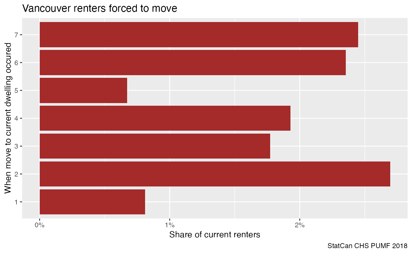
This looks interesting in that there seem to be distinct periods when the frequency of being forced to move changed, recognizing that longer ago brackets are conditional on not having moved after.
With PUMF data we need to be aware that we are dealing with a
synthetic sample that has been altered from the original survey
responses for privacy reasons. With that, and the general uncertainty
when dealing with survey data, it is important to assess how good these
estimates are. Some PUMF data ship with bootstrap weights to facilitate
this, when this is not the case the canpumf package
fills the gap via the add_bootstrap_weights function. By
default it adds 500 bootstrap weights. The function can act on a
database connection or a tibble. If it’s a database connection, then the
weights get stored in the database by default and will be re-used on
subsequent calls without the need to re-generate them.
plot_data <- renter_chs_pumf |>
  add_bootstrap_weights(weight_col = "Household weight", seed=42) |>
  filter(`Geographic grouping`=="Vancouver") |>
  summarise(across(matches("CPBSW\\d+|Household weight"),sum),
            .by=c(`Previous accommodations - when move to current dwelling occurred`,
                  `Previous accommodations - forced to move`)) |>
  collect() |>
  pivot_longer(matches("CPBSW\\d+|Household weight"),names_to="weights") |>
  group_by(weights) |>
  mutate(share=value/sum(value)) |>
  filter(`Previous accommodations - forced to move`=="Yes",
         !grepl("10",`Previous accommodations - when move to current dwelling occurred`))
#> Warning: The input tbl has dplyr operations (select, group_by, etc.) that
#> cannot be replayed on the BSW view — they would drop BSW columns or change
#> aggregation semantics. Apply them manually to the returned tbl.


ggplot(plot_data,aes(x=`Previous accommodations - when move to current dwelling occurred`,y=share)) +
  geom_boxplot(fill="brown") +
  coord_flip() +
  scale_y_continuous(labels=scales::percent) +
  labs(title="Vancouver renters forced to move",
       x="When move to current dwelling occurred",
       y="Share of current renters",
       caption="StatCan CHS PUMF 2018")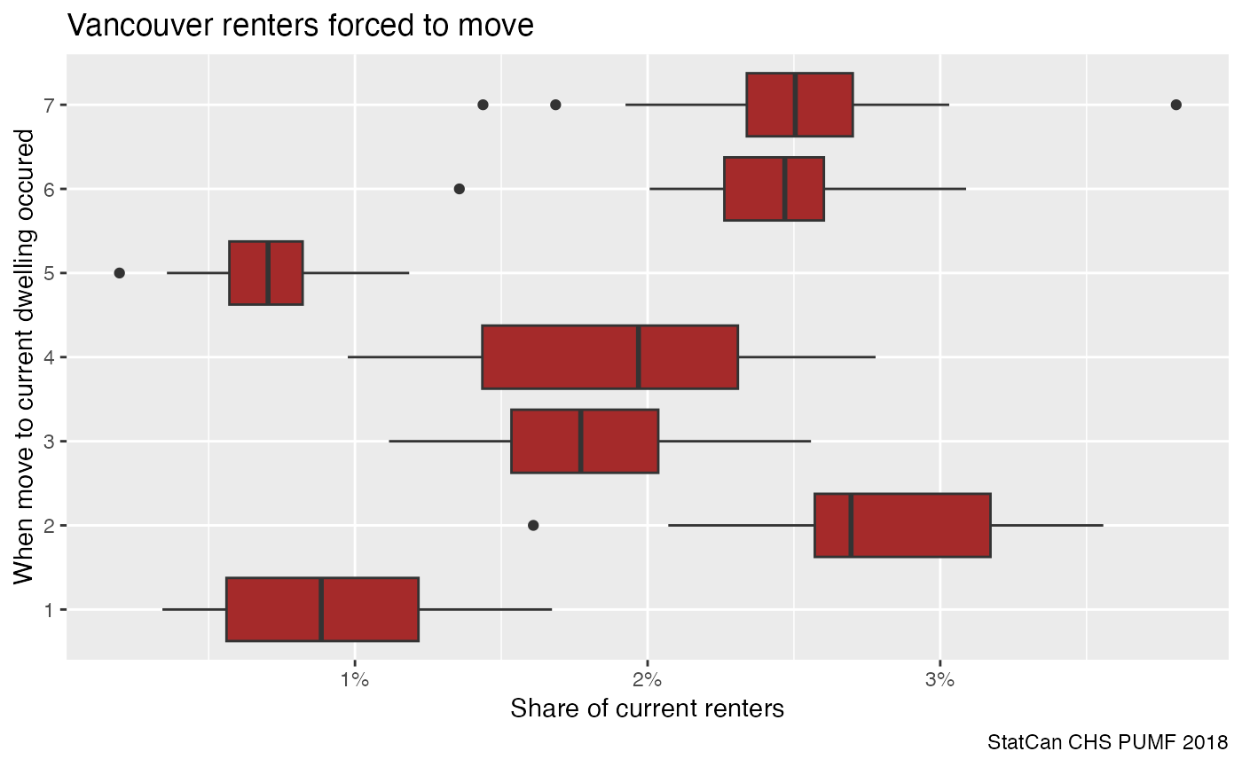
This shows that the changes in frequency of forced moves are fairly robust to sampling issues. The initial jump and then final reduction in risk of being forced to move are interesting, the final reduction may be due to the strengthening of the residential tenancy act in that timeframe.
Another complication when interpreting the data is that the previous accommodation where current renters were forced to move from may have been in a different metro are. The CHS does have some data on the location of the previous residence, but only note if it was in the same or a different city, not metro area. We can add this variable in to see what effect it has.
plot_data <- renter_chs_pumf |>
  add_bootstrap_weights(weight_col = "Household weight", seed=42) |>
  filter(`Geographic grouping`=="Vancouver") |>
  summarise(across(matches("CPBSW\\d+|Household weight"),sum),
            .by=c(`Previous accommodations - when move to current dwelling occurred`,
                  `Previous accommodations - location of previous dwelling`,
                  `Previous accommodations - forced to move`)) |>
  collect() |>
  pivot_longer(matches("CPBSW\\d+|Household weight"),names_to="weights") |>
  group_by(`Previous accommodations - location of previous dwelling`,
           weights) |>
  mutate(share=value/sum(value)) |>
  filter(`Previous accommodations - forced to move`=="Yes",
         !grepl("10",`Previous accommodations - when move to current dwelling occurred`)) |>
  mutate(`Location of previous dwelling` = gsub("\\.\\.\\..+$","",`Previous accommodations - location of previous dwelling`))
#> Warning: The input tbl has dplyr operations (select, group_by, etc.) that
#> cannot be replayed on the BSW view — they would drop BSW columns or change
#> aggregation semantics. Apply them manually to the returned tbl.


ggplot(plot_data,aes(x=`Previous accommodations - when move to current dwelling occurred`,
                     fill=`Location of previous dwelling`,
                     y=share)) +
  geom_boxplot(position="dodge") +
  coord_flip() +
  scale_y_continuous(labels=scales::percent) +
  labs(title="Vancouver renters forced to move",
       x="When move to current dwelling occurred",
       y="Share of current renters",
       caption="StatCan CHS PUMF 2018")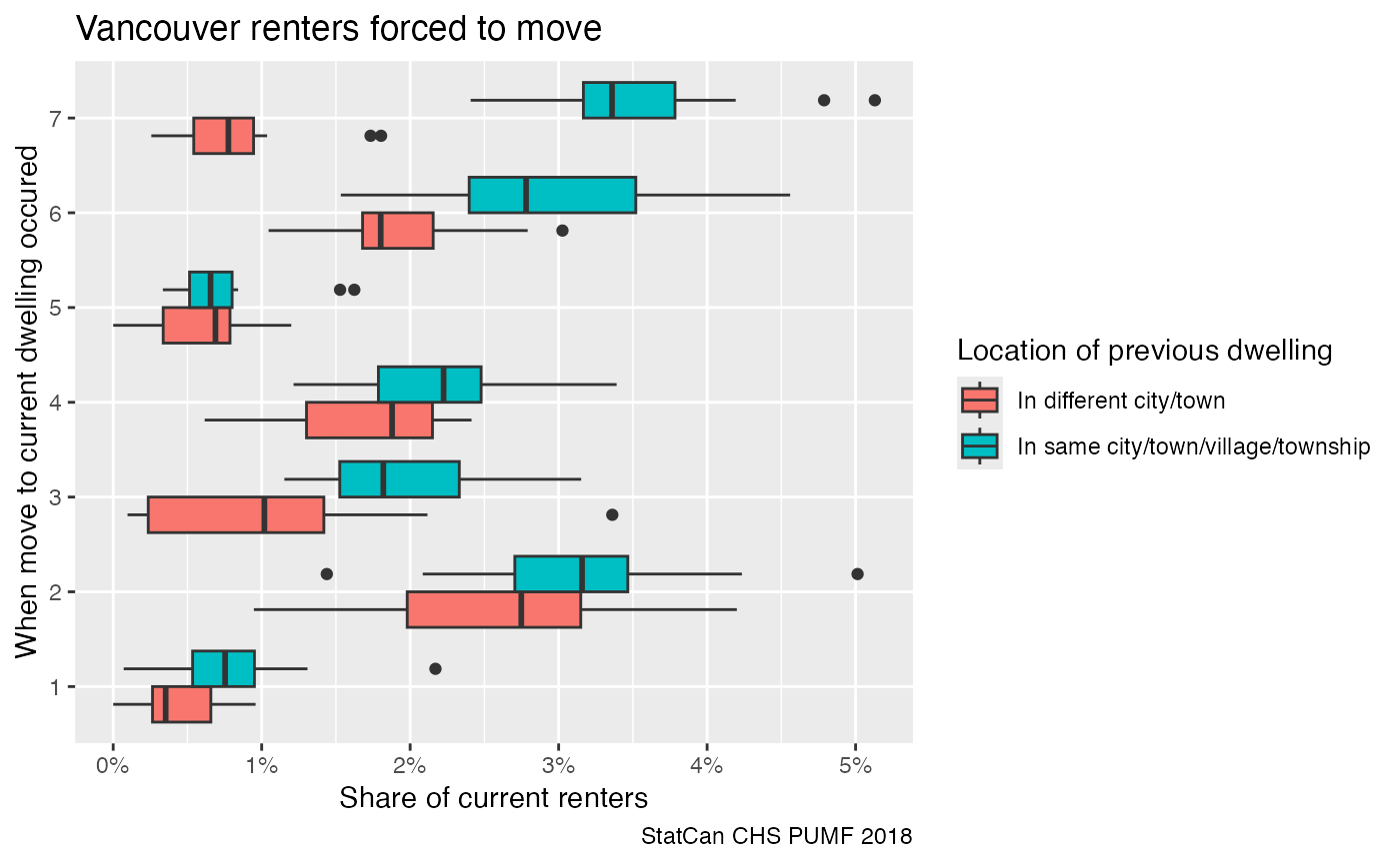
Here we see the frequency of forced moves is slightly elevated for people moving within the same city. It will take more digging through the data to see what might cause this.
One way to contextualize this is to compare it to other Canadian CMAs.
plot_data <- renter_chs_pumf |>
  collect() |>
  add_bootstrap_weights(weight_col = "Household weight", seed=42) |>
  filter(`Geographic grouping` %in% c("Vancouver","Toronto","Montréal","Calgary","Ottawa-Gatineau","Winnipeg")) |>
  group_by(`Previous accommodations - when move to current dwelling occurred`,
           `Previous accommodations - location of previous dwelling`,
           `Geographic grouping`,
           `Previous accommodations - forced to move`) |>
  summarise(across(matches("CPBSW\\d+|Household weight"),sum),.groups="drop") |>
  pivot_longer(matches("CPBSW\\d+|Household weight"),names_to="weights") |>
  group_by(`Previous accommodations - location of previous dwelling`,
           `Geographic grouping`,
           weights) |>
  mutate(share=value/sum(value)) |>
  filter(`Previous accommodations - forced to move`=="Yes",
         !grepl("10",`Previous accommodations - when move to current dwelling occurred`)) |>
  mutate(`Location of previous dwelling` = gsub("\\/town.+$","",`Previous accommodations - location of previous dwelling`))
#>   Replicate 50 / 500 ...
#>   Replicate 100 / 500 ...
#>   Replicate 150 / 500 ...
#>   Replicate 200 / 500 ...
#>   Replicate 250 / 500 ...
#>   Replicate 300 / 500 ...
#>   Replicate 350 / 500 ...
#>   Replicate 400 / 500 ...
#>   Replicate 450 / 500 ...
#>   Replicate 500 / 500 ...


ggplot(plot_data,aes(x=`Previous accommodations - when move to current dwelling occurred`,
                     fill=`Location of previous dwelling`,
                     y=share)) +
  geom_boxplot(position="dodge") +
  coord_flip() +
  facet_wrap("`Geographic grouping`") +
  theme(legend.position = "bottom") +
  scale_y_continuous(labels=scales::percent) +
  labs(title="Renters forced to move",
       subtitle="(based on households currently renting that did not move in past 5 years or\nhouseholds that moved in past 5 years that rented their previous dweling)",
       x="When move to current dwelling occurred",
       y="Share of current renters",
       caption="StatCan CHS PUMF 2018")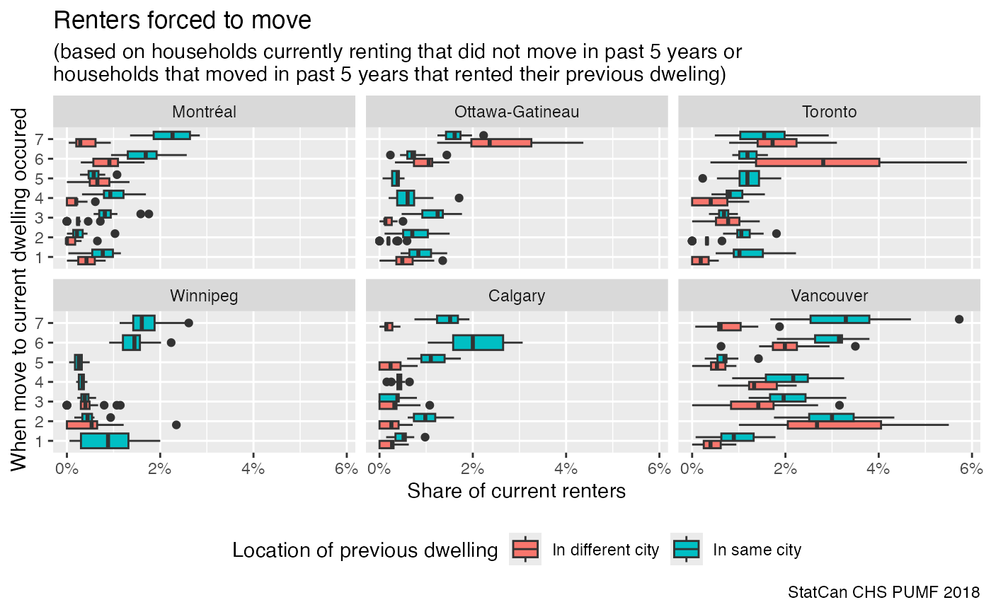
This shows that patterns vary across cities, Calgary’s elevated rate of forced moves in four to five year timeframe may be due to the heating up of the rental market during the boom phase at that time, where rent hikes and lack of rent control may have forced people to move.
This data is worth exploring further, but for the example vignette this will have to do.