
Making maps with cancensus
Source:vignettes/Making_maps_with_cancensus.Rmd
Making_maps_with_cancensus.RmdSpatial data in cancensus
cancensus can retrieve spatial data either on its own or packaged together with Census data.
You can specify whether you want data returned in an
sf-class data frame or as a sp-class
SpatialPolygonsDataFrame object. There are advantages to each spatial
format. The sf spatial framework is under development as
the new principal spatial library for R and takes advantage of the Simple Features
standard.
On the other hand, sp has been around for a long time
with development starting in the early 2000s and, as a result, it is a
robust and well-maintained package with a large ecosystem of specialized
packages that rely on it. First released in October 2016,
sf is a package still under development can be buggy and
prone to breaking.
cancensus retrieves Census geographic data as
GeoJSON objects and then converts them into either sp or
sf objects depending on the geo_format
parameter input. The examples in this vignette assume sf
class geography.
Maps with base R graphics
The sf package provides a wrapper around the base R
plot() function and largely works the same way with most of
the same custom graphical parameters. One key thing about
sf.plot() is that it will plot every column of a sf data
frame separately unless you specify a particular column. In this case,
the household income variable we selected is stored in the
v_CA16_2397 column. Plotting it is easy.
plot(toronto["median_hh_income"], main = "Toronto Household Income by CSD in 2020")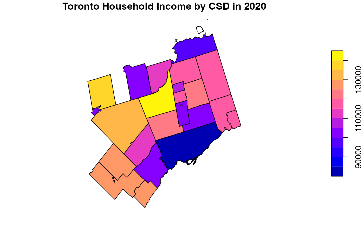
You can specify titles, colour palettes, breaks, background colour,
lines, borders, transparency, graticules, and much more by taking
advantage of the available parameters. You can also combine layers of
graphics objects made with plot() by running different
plots and adding the add = TRUE parameter.
plot(st_geometry(toronto), col = NA, main = "Toronto CSDs with Median HH Income > $125,000 in 2020", lty = 3)
plot(st_geometry(toronto[toronto$median_hh_income > 125000,]), col = "red", add = TRUE)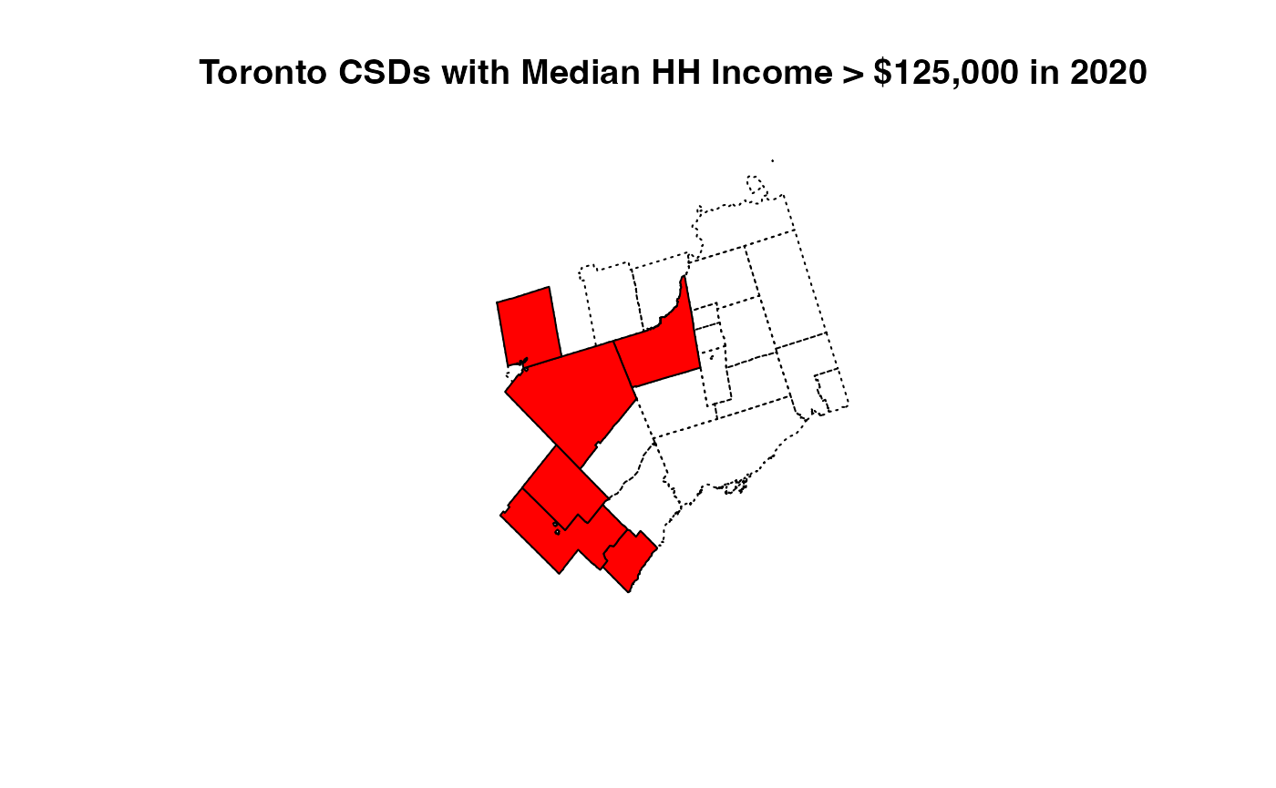
Maps with ggplot2
Plotting sf objects with ggplot2 is very
straightforward with the built-in geom_sf layer in the
latest version of ggplot2.
ggplot2 supports all types of simple features and can
automatically read and align CRS across multiple layers, can
automatically adjust aspect ratio, and will automatically draw a
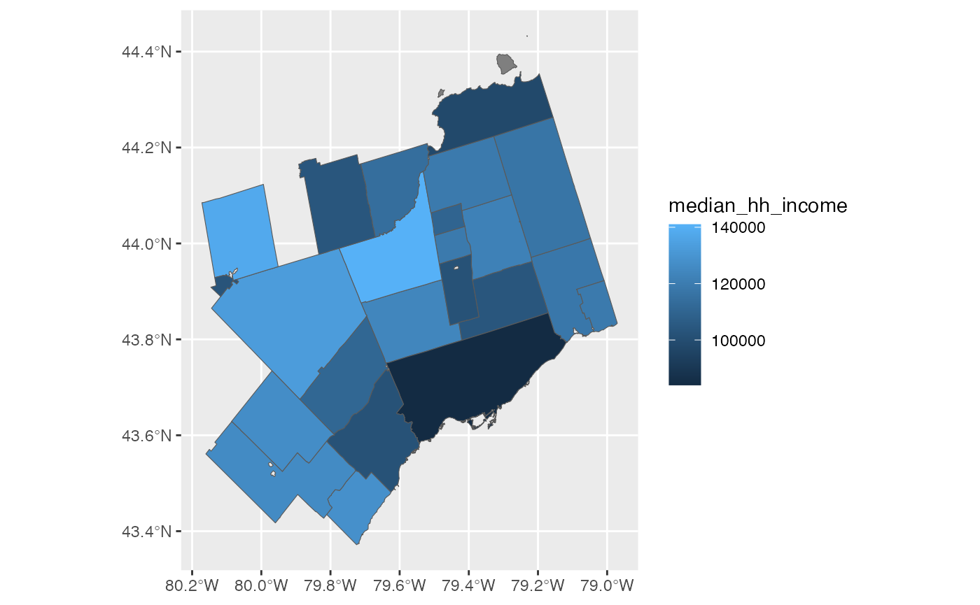
graticule for your map. The advantage of using ggplot2 for
static maps is the customization and flexibility offered by the
ggplot2 layer and geom system.
An example of a basic map.
Or a similar map with all of the trimmings:
ggplot(toronto) + geom_sf(aes(fill = median_hh_income), colour = "grey") +
  scale_fill_viridis_c("Median HH Income", labels = scales::dollar) + theme_minimal() +
  theme(panel.grid = element_blank(),
        axis.text = element_blank(),
        axis.ticks = element_blank()) +
  coord_sf(datum=NA) +
  labs(title = "Median Household Income in 2020", subtitle = "Toronto Census Subdivisions, 2021 Census")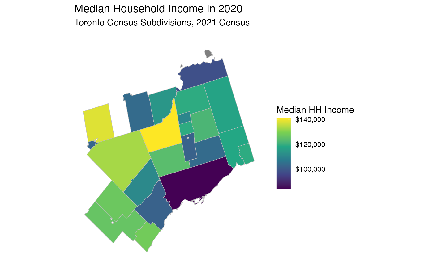
Interactive maps with leaflet
The leaflet library is a mainstay behind interactive web maps, and RStudio has package that allows creation of interactive leaflet maps without having to leave R or use Javascript.
Leaflet for R can natively read in sf or sp
class objects. Leaflet maps use a tile layer server to generate the base
maps on which your data is plotted. There’s a number of different base
layers available to use, although some require third party API keys. A
gallery of available basemaps can be found here.
library(leaflet)
leaflet(toronto) %>%
  addProviderTiles(providers$CartoDB.Positron) %>%
  addPolygons()
Adding colour ramps and additional interactivity takes a little bit more work but is still pretty easy to implement. Following this example we can specify the colour ramp to match our needs.
bins <- c(0, 30000,40000, 50000,60000, 70000,80000, 90000,100000, 110000, Inf)
pal <- colorBin("RdYlBu", domain = toronto$v_CA16_2397, bins = bins)
leaflet(toronto) %>%
  addProviderTiles(providers$CartoDB.Positron) %>%
  addPolygons(fillColor = ~pal(median_hh_income),
              color = "white",
              weight = 1,
              opacity = 1,
              fillOpacity = 0.65)